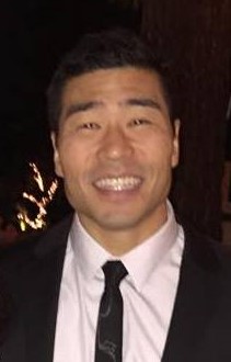
Charles Lee

I am a graduate from a data analytics boot camp from the continuing education division of the University of California, Irvine. In my time at the data analytics boot camp, we covered various topics within the world of data analytics, including machine learning, big data analytics, data visualizations, web scrapping, social media mining, front-end visualizations, databases (SQL and NoSQL), full-stack development and business intelligence software (Tableau). In addition, we covered the programming languages of Python, R and JavaScript.
Currently, I work full-time as a design verification engineer in a chip design team at Broadcom but I am transitioning into the data analytics realm. Additionally, I freelance part-time as a data scientist for Mixcord. During my transition period, I have continued to grow myself by taking various courses at Business Science University, DataCamp, and Udemy. I am currently enrolled in Udacity's data engineering nanodegree program. Overall I love data analytics and hope to continue to grow in this area.
View My LinkedIn Profile
Deployed Shiny App
Border Entry Dashboard App Challenge for course was to create our own application. This is my app dashboard for border entry by ports into the United States. I have a summary table for the border entry from January of 1996 to March of 2019. This dataset was taken from Kaggle . Dataset originally sourced from Bureau of Transportation Statistics (BTS). App is reactive to the input selectors on the sidebar. Added ability to forecast the count of people entering using an XGBoost and Linear Regression models. The linear regression model is used when time unit is selected as year to better forecast trends. The XGBoost model is used for remainder of time units. Github repository can be found here.
Sales Dashboard App Sales dashboard created during the course. Created a reactive dashboard with ability to forecast sales based upon time unit chosen. Prediction is provided via an xgboost and linear model based upon the time unit chosen for prediction.
Price Prediction App Secondary application created during the Business Science University course. Created a price prediction app that could help to price bike models based upon frame and bike category. Additionally, based upon model keywords as well. Prediction uses a trained xgboost model.
Summary:
Learning Shiny Web App development from Business Science University Course
Learned how to create a dashboard using Flexdashboard and integrating Shiny for UI reactivity. The dashboard allows the user to see bike sales based upon bike type and family selected within a selected date range. A Choropleth map to denote sales based upon the user selected input is shown. In addition, a line chart is shown denoting the sales based upon the user input. The user is allowed to drill down into the chart further based upon daily, weekly, monthly, quarterly and yearly sales aggregation. Additionally, the user can also forecast sales using an XGBoost or linear regression model dependent upon the time unit chosen. The application will dynamically make predictions based upon the inputs selected on the dashboard as well as the time unit. Learned how to customize apps using CSS.
Also learned how to create a price prediction app using a Xgboost trained model. The app also uses Shiny for UI reactivty allowing the user to input a bike name, family and type and to then predict the price and to also plot the bike on a plot of established bike products.
Apps shown are the output from course material. Currently, working on an independent app based upon the knowledge learned during the course. App will be a dashboard looking at the educational expenditures by state in the US and looking at the testing performance.
Implementation Notes for Project
App was deployed using shinyapps.io